


“These go to eleven!”
Financial transaction volumes - amplified in some areas, turned down in others

“These go to eleven!” Nigel Tufnell
The volume of transactions (velocity) is usually better than price level as a measure the health of a market. Velocity is hard to fake. In contrast, price level may be ‘spoofed’ for a surprisingly long time. Transaction volumes can also function as a gauge of overall allocation of system liquidity. Any market which suffers withdrawal of liquidity will face a headwind against further price gains. Some parts of the U.S. financial system have volumes turned up to eleven. Other parts have volumes turned down to about 5, or less.

We mapped the transaction volumes (velocity) of all the main cash securities (bonds and equities), transactions for Tri-party, DVP and GCF repo plus the main liquidity draining liabilities of the Federal Reserve (Reserve balances, ONRRP and Treasury General Account). These last three are expressed as stock, not transactions, though in the case of the ONRRP it explicitly amounts to the same thing, and is implicit in Reserve balances and TGA. The total of 35 time series captures most of the liquid U.S. financial universe, minus real-estate and derivatives. Data comes from SIFMA, FINRA Trace, the Office of Financial Research and the Federal Reserve.
Of course, any conclusions come in recognition of Korzybski’s warning on semantic confusion, “the map is not the territory”. Conscious of his warning, I believe the effort highlights some important changes in the system.
The full dataset only runs for the four years since mid-2019. Broadly, the first two years contains the COVID19 monetary response, while the second two years captures the latter period of QE which led to excess liquidity needing massive investment into ONRRP and monetary policy tightening and QT. When divided into equal 2 year periods a clear evolution is apparent which reflects a major shift of liquidity in the US financial system.
There are several ways to express the changes in relationships over time in a large dataset. I use a version of k-medoids clustering to assign each series to a cluster, using a normalised dataset, . The approach is close to the intuitive allocation to categories that humans often use heuristically; if a ‘thing’ looks closer to the median version of a table than the median version of a chair, then I will call this ‘thing’ a table. In the present case, clustering identifies groups of liquidity responses.
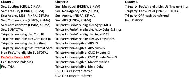
Below are the 3 basic clusters identified between mid-2019 and mid-2021.
The charts that follow show how each series evolved within their cluster from mid-2019 to mid-2021, expressed in standard deviations. Individual series are shown as light grey lines, the mean (which is not the loci) in heavier coloured lines. There is clear, though varied, correlation within each cluster. Cluster 1 shows marked trend up. Cluster 2 began to rise till COVID19 outbreak, then fell steadily. Cluster 3 rises in line with the other clusters in the early period, then falls and begins to rise again in the latter part of the period. FedWire Funds and Reserve balances are both closely associated with Cluster 1.

Now let’s look at the period mid-2021 till now (mid-2023). Many of the members of the Cluster 2 shifted to Cluster 3, and account for all the majority of classes of FedWire eligible collateral plus a large number of collateral classes that not eligible for FedWire. And now FedWire Funds and ONRRP are both closely associated with Cluster 3.


Time series behaviour too, is very different in the second period (2021-2023). Cluster 1 now falls, the opposite behaviour to how the cluster behaved in the first period (2019-2021). Note that Fed’s Reserve balances is present in Cluster 1 in both periods, as is the Treasury General Account (TGA). Equity transactions also continued in Cluster 1 in both periods. As do other important securities markets, such as Treasuries. All saw transaction volumes decline in correlated fashion in this second period, though towards the end of the period the moved back to median levels.
Transaction volumes for all FedWire eligible repo collateral transactions plus DVP rose strongly in the second period. And transactions volumes correlate strongly with turnover in FedWire Funds service. They are all turned up to eleven.
The explanation is the huge shift in FedWire eligible Tri-party repo allocated to ONRRP. Transactions are overwhelmingly dominated by Treasury collateral, though the pickup in transactions (liquidity) seems to have permeated many other collateral types, both FedWire eligible and non-eligible. Collateral encumbrance caused by the enormous rise in daily ONRRP transactions may be the explanation.
What are the key takeaways? There have been clear reallocations of transaction volumes and therefore liquidity, around the U.S. financial system. US system-wide liquidity has shifted very significantly away from securities, including equities and towards HQLA repo. This change is associated with a pronounced increase in the Federal Reserve liabilities held in ONRRP facing money-market funds. That has meant the relative liquidity impact of Reserve balances has declined.
That said, the mean of Cluster 1 has bounced back to be close to zero, which suggests liquidity is currently stable, compared to the entire two year period. The liquidity injection made by the Fed following the bankruptcy of SVB (and others) contributed to this recent turnaround - though the breadth of securities market has become limited, which reflects lower liquidity.
There may be a relationship between the TGA and equities to consider too. Commentators have speculated that equity market outperformance of H1 2023 may have been sustained by the dramatic rundown in TGA, which boosted risky asset performance. The fiscal boost of 2020-2021 lifted TGA in the earlier period, as it lifted equities. As TGA was subsequently run down, it provided liquidity as Reserve balances fell. If the TGA continues to rise, liquidity has to be drained and seems to have a historic association with securities transaction volumes.
The final chart below summarises the last two years; showing the correlation of the entire transactions dataset 2021-2023 ordered by the first principal component of data. From this we can see the financial system has broadly fallen into two camps, analogous to the Cluster 1 and Cluster 3. These two camps are:
Markets that show transactions volumes increasing in line with ONRRP (including most repo markets, including DVP) and FedWire Funds service. These markets/collateral types are presented in top left of the chart.
On the other hand, most securities, including equities, repo for equities, repo for international securities, non-FedWire eligible repo have experienced relative transaction volume decline, concurrent with a decline in Reserve balances at the Fed.

If this is an appropriate summary of liquidity distribution within the U.S. financial system, it looks unbalanced.