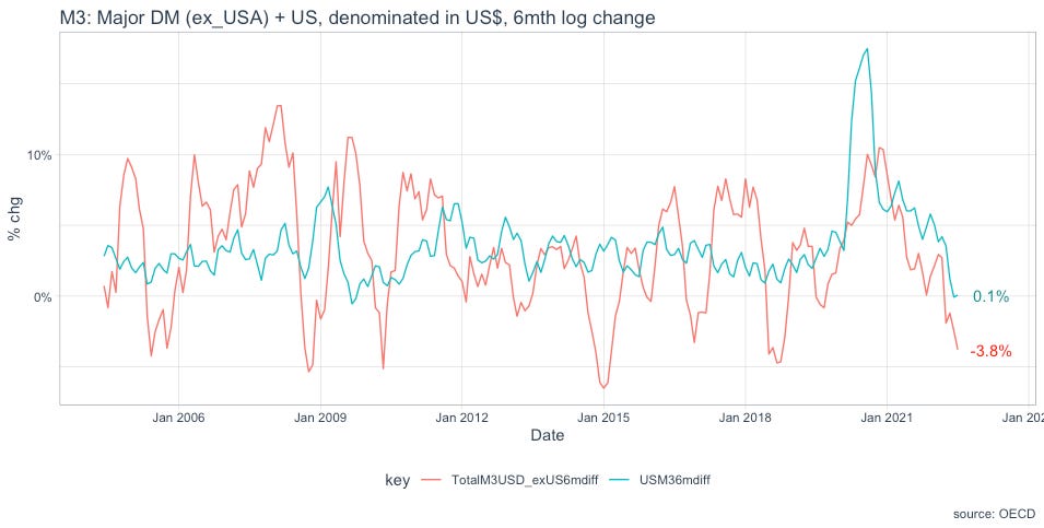
To see ‘exorbitant privilege’ in action (the actual dollar privilege, not this website), just take a look at the following two charts.
The first shows the monetary aggregate M1 (currency and demand deposits) for the US and a broad selection of major economies, both denominated in US$. The second shows M3, a broader measure of money, for the same constituents: USA and the same broad selection of major economies.
Why denominate non-dollar money supply in dollars? Because much of international business is conducted in dollars and domestic supply chains are usually highly influenced by changes in dollar costs. Plus, the combined dollar denominated money supply is highly important for financial market developments both within the US and in the wider world.
How is the dollar’s exorbitant privilege revealed in the charts? Well, they clearly show the US created by far the most money (blue lines in both charts) which is responsible for the wave of inflation affecting the globe. Yet the policy response of the Federal Reserve to address that inflation has had a much larger negative impact on the red lines - the non-US monetary aggregates. This is due to the strength of the dollar created by the same Fed’s tightening.
The dollar’s Exorbitant Privilege remains intact.
It remains to be seen how US Congress will eventually react to the appreciating dollar. It is not a stretch to imagine rising jobless will prompt political complaint about foreigners pernicious currency manipulation. For the non-dollar world it’s a case of heads you win, or tails I will get the blame.


